How I avoided CSS Styling conflicts using the Shadow DOM
April 11th, 2022 — 3 min read — Gideon Idoko
I worked on this project (an embeddable widget) where I had to ensure that the styling of the webpage doesn't conflict with the styling of the widget component. Knowing fully well that overriding CSS wasn't an efficient solution, I sought a better technique. Alas, I came across the Shadow DOM API with its few advantages such as data hiding and encapsulation.
The Shadow DOM is one of the three technologies that make up the web components. The other technologies are Custom Elements and HTML Template.
In this article, I will explain how I avoided styling conflicts by hiding the styles and behaviour of an element from other elements on a webpage.
Prerequisite
- Basic knowledge of JavaScript
- Understanding of how the DOM (Document Object Model) works.
The Shadow DOM API
The Shadow DOM API is a new type of DOM API that enables the creation of custom elements with their own style, without affecting other elements on the page. The Shadow (hidden) DOM enables a hidden DOM tree to be attached to elements in the light or normal DOM tree.
Because this shadow DOM is hidden, just like iframes, the styles and behaviour within the shadow DOM won't affect the styles and behaviour outside of it and vice versa.

source: MDN
The shadow host is the node that houses a Shadow DOM while the shadow root is the root node of the shadow DOM tree.
Hiding the styles and behaviour of an element using the Shadow DOM
To hide the styles and behaviour of an element, you have to attach a shadow root to the element. The Shadow DOM API provides a method, Element.attachShadow() to attach a shadow root to elements. The attachShadow method takes an options object as its only parameter. This options object has only one option — mode with a value that is either open or closed.
The shadow root will be accessible via Element.shadowRoot if the mode is open. In cases where the mode is close Element.shadowRoot will be null;
const elem1 = document.getElementbyId('elem1');
const elem2 = document.getElementbyId('elem2');
elem1.attachShadow({ mode: 'open' });
elem2.attachShadow({ mode: 'closed' });
console.log(elem1.shadowRoot); // #document-fragment
console.log(elem2.shadowRoot); // null (a reference
// to the shadowroot should be used instead)
I used the closed value on the widget I worked on since I didn't want the widget's shadow DOM to be accessed via the Element.shadowRoot due to some security issues. The below example looks like how I implemented the widget.
<h1>SHADOW DOM</h1>
<div id="widget"></div>
<script>
  const widget = document.getElementById('widget');
  const shadowRoot = widget.attachShadow({ mode: 'closed' });
  // shadowRoot references the shadow root attached to widget

  // css
  const css = `
    h1 {
        color: red;
    }
    .widget-component {
        border: 1px solid red;
    }
    `;

  // html
  const widgetHtml = `
    <style>${css}</style>

    <div class="widget-component"><h1>Widget</h1></div>
    `;

  // write the html to the shadow DOM
  shadowRoot.innerHTML = widgetHtml;
</script>
NB: I used a custom element in place of the div with an id of "widget" in the actual implementation of the widget. I used a normal element here because custom elements are outside the scope of this article.
Below is the output of the above example:
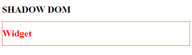
Now, there will be no styles and JavaScript behaviour collision or conflict between the widget and other elements on the page that are outside the widget's shadow DOM.
Wrap Up
You've seen how I avoided conflicting styles and behaviour between my widget and other elements on the page on which the widget was present using the shadow DOM. You also saw the different modes by which the shadow root can be attached to a normal DOM element.
Thanks :)